Modernizing a Legacy Cybersecurity Product Suite
Challenge
We needed to:
Introduce modern visual language and UX best practices
Align multiple products under a unified direction
Avoid alienating a conservative, established user base
Work within significant engineering bandwidth constraints
Roll out changes incrementally across products and surfaces
This required balancing modernization with stability.
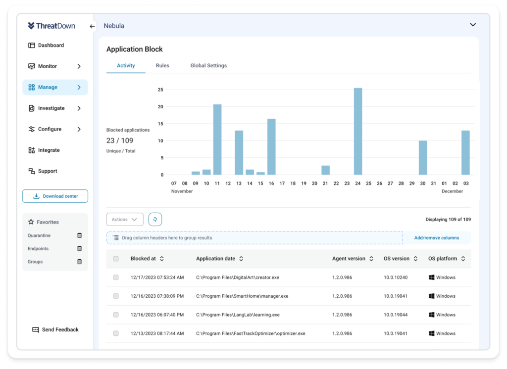
Scope of Refresh
The initial rollout modernized the core product and later expanded to:
UI components and layout systems
Iconography and illustrations
In-app surfaces and workflows
Email templates and supporting materials
A major “big-bang” release updated the primary product, while broader adoption occurred gradually over several years.
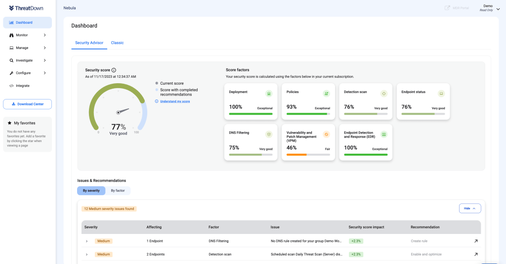
Outcome
The refresh unified the product suite under a cohesive visual direction and strengthened perceived trust. More importantly, it laid the groundwork for reusable components and later design system development, enabling more consistent implementation over time.
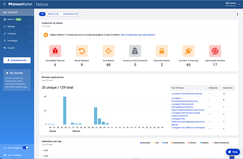
The Malwarebytes B2B product suite was nearly a decade old and originally designed by engineers without a cohesive design strategy. Over time, multiple designers contributed work without shared standards, resulting in:
Inconsistent UI patterns
Clunky, outdated visuals
Disjointed user experiences
Erosion of product trust — critical in cybersecurity
The goal was to modernize the product while respecting an established user base primarily composed of long-time, enterprise security professionals.
CLIENT
ThreatDown (Malwarebytes)
SCOPE
Product UI • Visual Brand • Component Library • Design Systems • Cross-Functional Leadership
My Role
As Visual Design Manager, I led a team of three designers through research, concept development, and direction setting. I guided critique sessions, narrowed multiple explorations into a unified vision, and presented the final direction to executive leadership for approval.
Following the initial rollout, I remained hands-on, translating the refresh into reusable components and foundational system standards.
Constraints
Engineering bandwidth limited the speed of implementation. Even with detailed Figma documentation and redlines, inconsistencies in interpretation highlighted the need for clearer pattern standards — reinforcing the importance of systemization.
Key Takeaway
A refresh is not a single launch but a transition. Visual change alone does not create consistency; shared standards and alignment do. The long-term impact comes from establishing structure that allows the product to evolve cohesively over time.